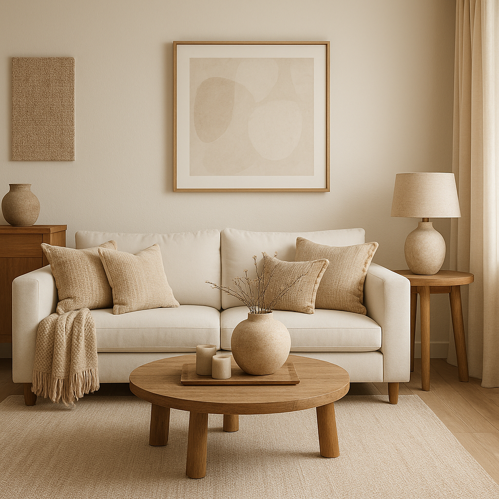
The Secret to Getting Neutrals Right in Interior Design
Understanding Colour, Undertones and the Depths of White
When clients say they want a neutral home, many imagine it’s as simple as choosing a tin of “white” paint. However, once you stand in front of a paint chart, you quickly realise that neutral isn’t straightforward at all. There are hundreds of variations, each with different undertones and depths, and they all behave differently depending on the light and the space.
That’s why understanding colour is essential before you even pick up a brush. Let’s break it down into three simple steps, as shown in my graphic:
1. Understanding Colour
Every neutral begins its life as part of the colour family. For example, a beige may have a yellow or red base, while a grey might lean green or purple. Because of this, two neutrals that look identical on a card can appear completely different once they’re on your walls.
Therefore, the first step is to ask: what colour family does this neutral come from? Once you know that, you can predict how it will behave with your flooring, furniture and fabrics.
2. Understanding Undertones
Although we call something “neutral,” it will always carry a hidden undertone. For instance, a cool grey with blue undertones feels crisp and modern, while a warm grey with brown undertones creates a cosier effect.
In addition, undertones react strongly to natural light. North-facing rooms tend to emphasise cooler undertones, so warmer neutrals are usually needed to balance them. On the other hand, south-facing rooms can make warm tones look too creamy, so cooler neutrals work better there.
Because of this, testing paint samples is vital. Put them directly on your walls, not just on sample cards, and observe them at different times of the day.
3. Gradations of White
Finally, let’s talk about white. Many people assume white is the easy option, but it is actually one of the trickiest. A pure, bright white can feel stark and flat, especially in a family home. Yet softer whites — think ivory, cream, or off-white — add warmth and depth.
Moreover, layering different whites together creates richness. A soft white on the walls, paired with crisp white woodwork and a creamy neutral on the ceiling, suddenly makes the room feel elegant and intentional.
For this reason, choosing the right “white” is never about picking one pot of paint. Instead, it’s about balancing gradations to create atmosphere and flow.
Why it matters
Neutrals are timeless, but they are not one-size-fits-all. Understanding colour families, recognising undertones, and using the right depth of white ensures your home feels balanced rather than bland.
And this is exactly what I do during a colour consultation. I look at your light, flooring, existing furniture and the feeling you want to create. Then, together, we find the right neutrals that will actually work for your home.
✨ If you’re stuck between “Warm White” and “Strong White” and wondering why neither feels quite right, let’s talk. A Consultation can save you time, money and a lot of frustration — and give you confidence that your neutrals will look stunning in every light.
✨ If you’d like help choosing the perfect neutrals for your home, book a consultation with me and let’s find the shades that actually work for your space.
image